
Career Passport
An education credential wallet for the California Community Colleges

The brief
California is home to millions of people who are building careers and skillsets outside of the typical 4-year degree. People are gaining skills through apprenticeships, community college courses, and other real-world experiences. Many of these paths do not result in a formal proof of knowledge.
When someone like Alex Rivera, a 28-year-old electrician trainee in Fresno, applies for a job, they can't easily prove what they know, and employers can't easily verify. Proving skills takes reference calls and a lot of trust in roles and industries that sit outside typical higher education tracks.
SpruceID was accepted as a competitor in the California Community Colleges Chancellor's Office (the District) wallet competition that included 4 total vendors. The competition was to build a credential wallet for people like Alex. People who are developing legitimate skills and need a better way to share that with potential employers.
The vendor submissions would be tested in an unmoderated user testing with 182 Californians, with specific performance metrics tracked.
Role
Our team was 1 project manager, 1 product manager, 3 engineers, and 1 designer. I was responsible for the product map and all the interface designs, and had a very involved role in shaping the interactions around the protocols.
Constraints
The District fixed the protocols, and every vendor had to support them: OID4VCI and VCALM for issuing credentials, OID4VP for sharing them, and CHAPI for passing a request from a website to the wallet.
Before designing any screens, I mapped what each protocol decided for the user and what it left open.
| Fixed by the protocols | Open to design |
|---|---|
| Every claim and share starts on a college or employer website and hands off to the app | What people see when they land in the app, and how it points them back |
| The employer decides which fields are required | How required and optional fields look, and what's selected by default |
| The college decides what data a credential carries | How that data reads: resume lines, and the issuer shown as a domain instead of a raw ID |
| Credentials arrive from outside the app | When to ask people to sign up |
Knowing the limits early kept the designs buildable. Engineering spent its time building screens instead of explaining why they couldn't exist. It also set the agenda: the three challenges all sit in the right-hand column.
The design problem
The District asked four vendors to put a working wallet in front of ordinary Californians, with no vendor staff in the room. Every vendor had proven they could handle the protocols, so the real test was whether a first-time user could claim four credentials and share them with an employer on their own.
That split into three challenges:
- Help people understand what they're doing and why
- Help holders make good decisions with their data
- Share from several credentials at once without losing people
1. Understanding each step
The north star for digital identity is tap-to-verify. Every extra screen costs adoption, and most people will trade some control for convenience. Security sits in the backend, where cryptography keeps data private, verifiable and tamper-proof. That freed the interface to stay light, so understanding had to come from the screens themselves. Three moves did most of the work.
Familiarity
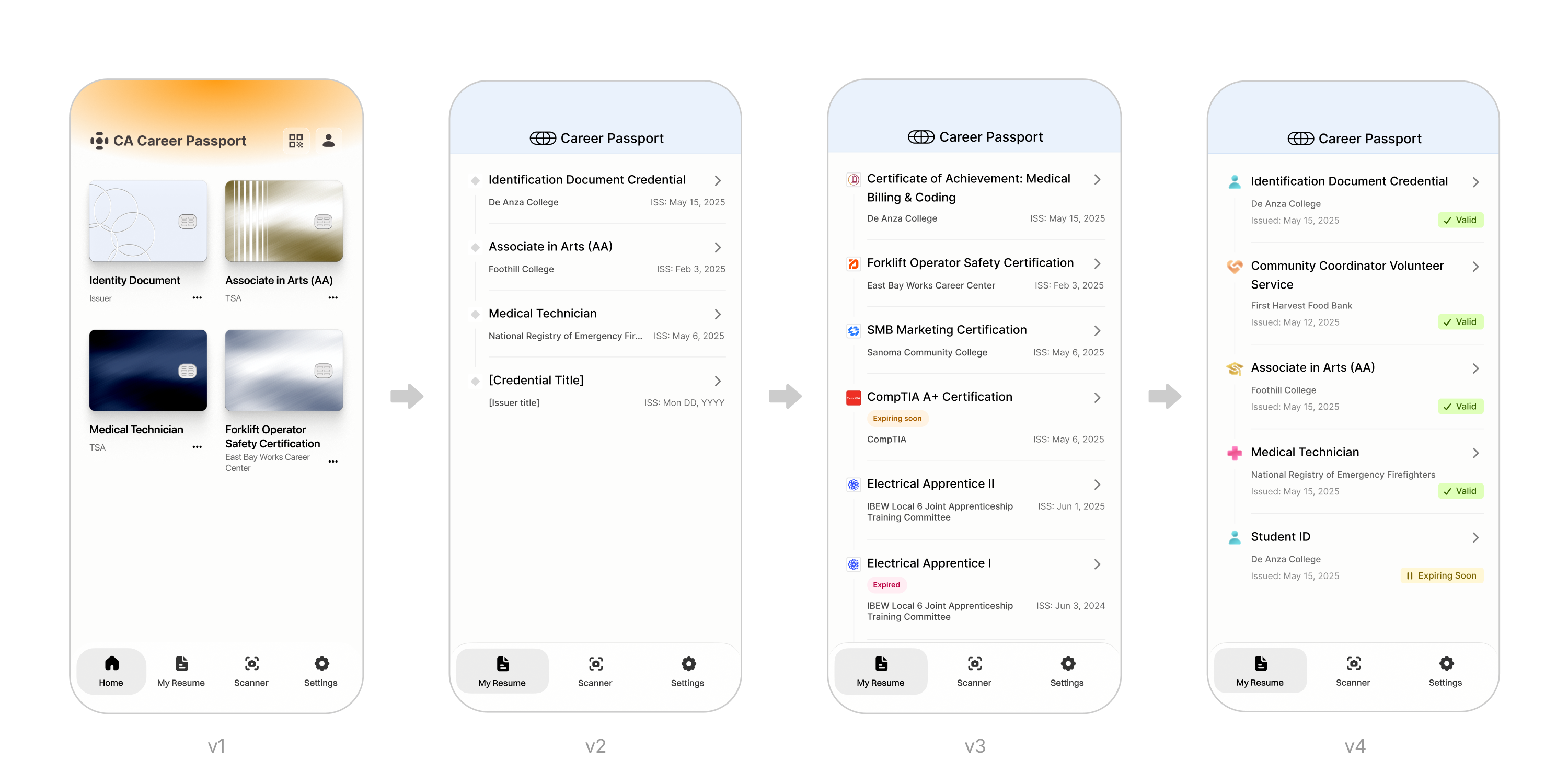
Career Passport started from Safe, Spruce's document vault app, which shows credentials as cards, like a banking app. Learners don't think of a certificate as something in a wallet. They think of it as a line on a resume. So the home screen became My Resume: each credential reads as an entry with its title, issuer, issue date and a plain status like Valid or Expiring Soon.
Onboarding
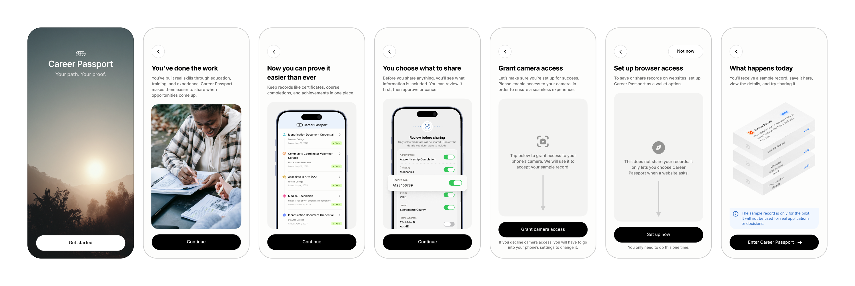
Most testers had never heard of a digital credential. Before anything happens, a short sequence explains the idea in their terms: you've done the work, now you can prove it, and you choose what to share. It then sets up camera and browser access, and ends with a sample record so the first real credential isn't a surprise.
Clear instruction
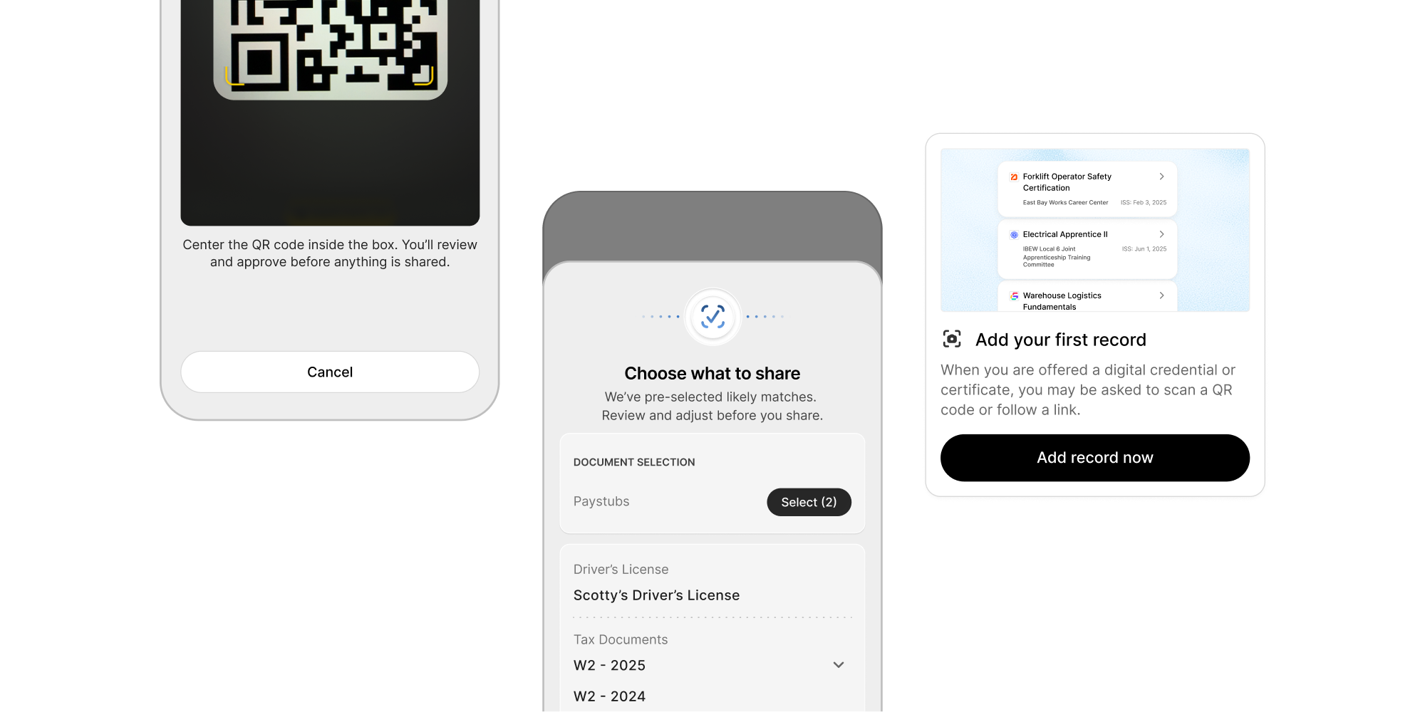
Every screen says what to do next in plain language, with no protocol terms. The scanner tells people they'll review and approve before anything is shared. The empty home screen explains that a college may ask them to scan a QR code or follow a link. Buttons are one word where possible, and every decision has two options, like Accept or Decline.
2. Good decisions with data
A wallet carries risk in both directions, so incoming and outgoing data follow the same rule: review before you commit.
Incoming
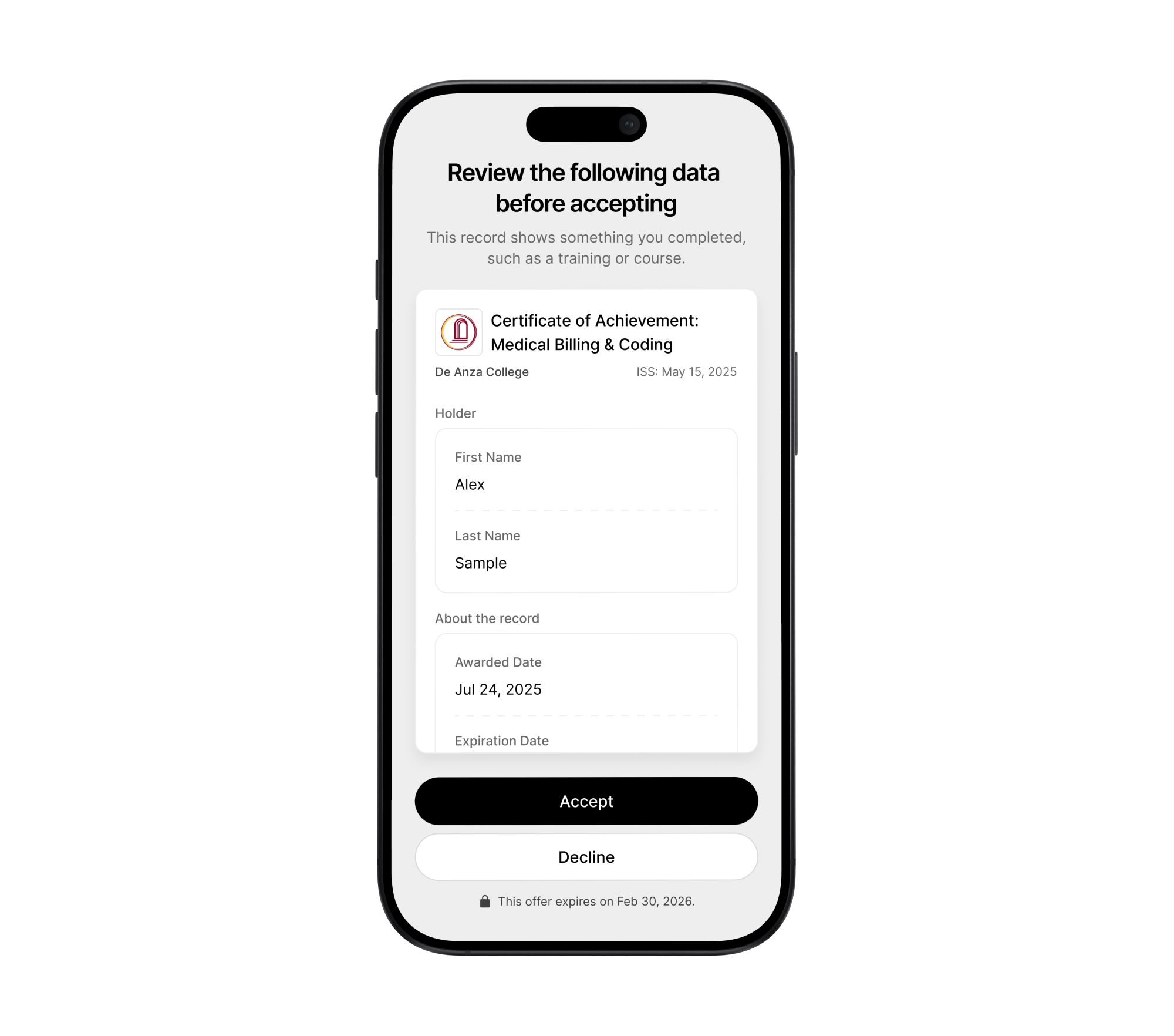
When a college offers a credential, the holder checks its data before accepting it. Crypto wallets show what happens when anyone can drop items into your account.
Outgoing
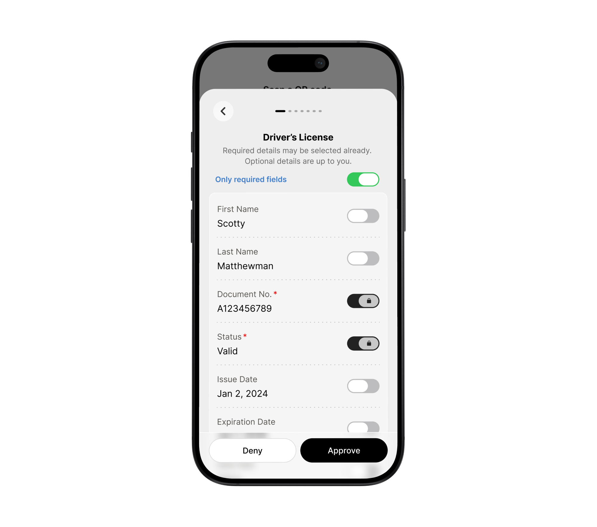
When an employer requests data, selective disclosure shows exactly what will leave the wallet. Required fields carry a red asterisk and a locked toggle. An “Only required fields” switch sets the minimum in one tap, so nobody turns off optional fields one by one.
3. Sharing from several credentials
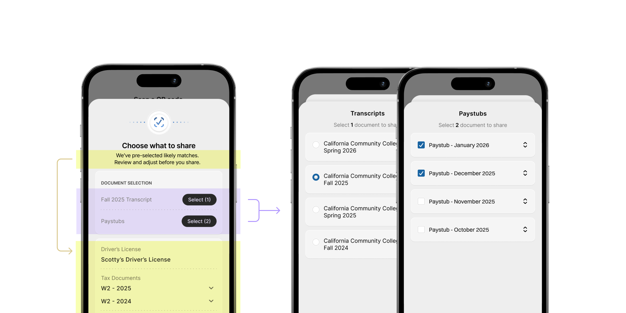
One employer request can ask for a transcript, two pay stubs and an ID. That's where step fatigue and lost context hit hardest, so the flow breaks into two steps.
Choosing credentials
The app reads the request and preselects likely matches by data format, credential title and issuer. When holders need to pick between versions, a second sheet slides over the first, which stays visible behind it, then slides away when they're done. Radio buttons mean pick one. Checkboxes mean pick several.
Choosing fields
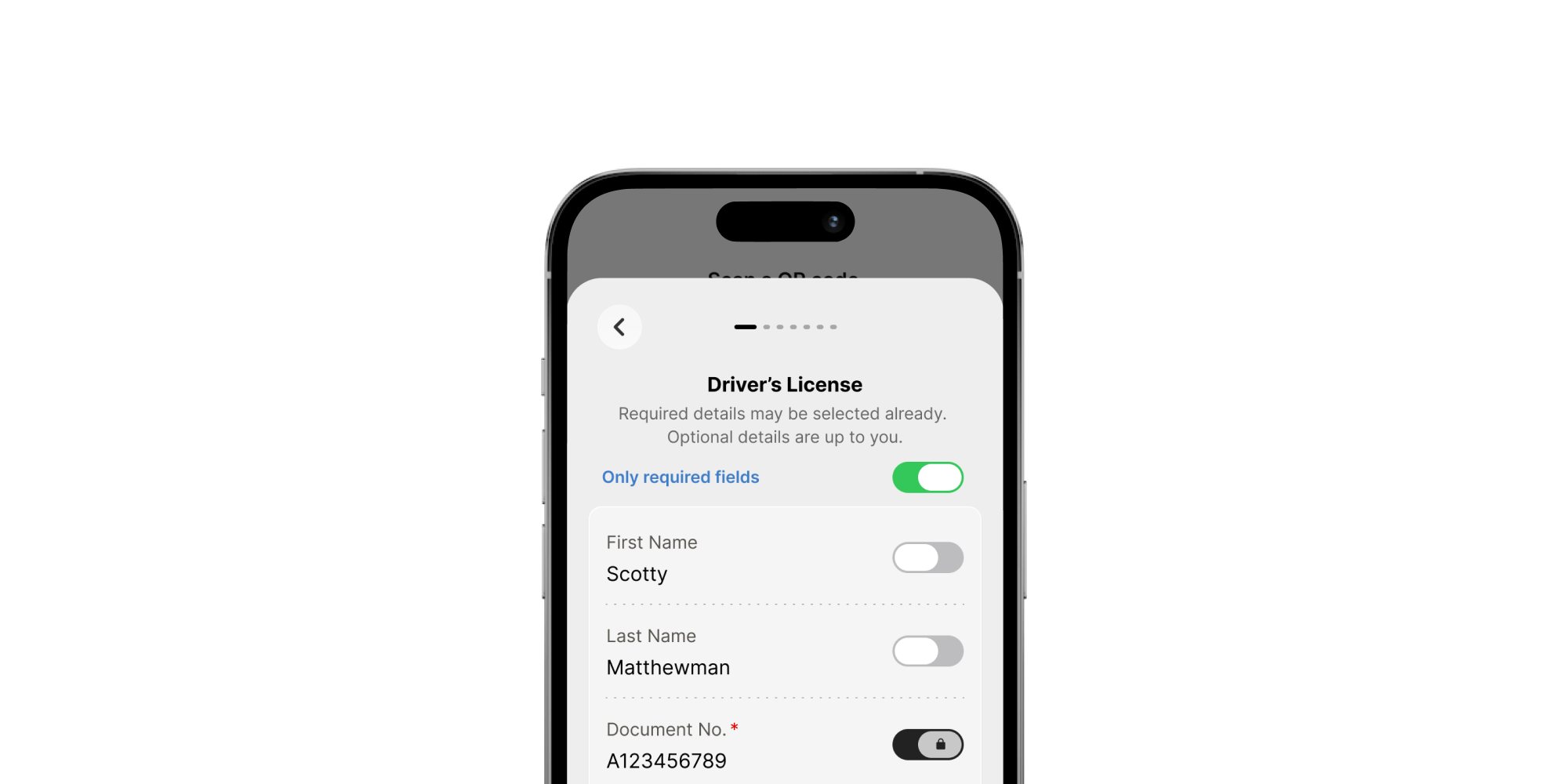
This is where the team disagreed. I wanted a single list of required fields grouped by credential, which is the fewest taps. The team wanted a page per credential, arguing that separation would help people understand what they were sharing. I thought it added taps without adding understanding. We shipped pagination as the safer bet for first-timers with no one to help them. I kept each page identical to single-credential disclosure and added progress dots to the nav row so it felt familiar.
Testing went smoothly and pagination stayed for the final assessment. I'd still test the single list, and Safe, our app on the App Store, is the natural place to try it.
Reflection
All three challenges came down to the same trade-off: how much control to show without slowing people down.
We settled on a strict backend and a simple interface. The app does the matching and sets sensible defaults. The person reviews and decides, with two clear choices at every step.
Our decision to go with a resume-styled interface wound up being a big part of our success. All the other teams rendered credentials as cards, and I think it confused their testers because the form did not fit the context.
An added complication to the testing, which helps explain some of the results, was a decision from the California team to use a protocol that required the user to not only go through a wallet registration flow between the native app and the user's default browser, but also jump between app and browser for nearly every interaction. This had a negative impact on users' experiences, but it was a technical limitation we were unable to skip.
In the District's final assessment, Californians who had never used a credential wallet picked up the app with no one from Spruce in the room. Most of them claimed every credential and shared it with an employer on their own.
- 69.6% claimed all 4 credentials, vs 44.0% for other vendors
- 91.3% claimed at least 1, vs 86.8%
- 97.4% of presentations succeeded, 4.7s median
- 0 crashes, data loss or P0 errors
- 87% felt safe, 87% would recommend, 91.3% want to use it at launch
- District accessibility review: 35 of 38 WCAG criteria supported, 3 partial
In terms of design and product takeaways, this project confirmed something I'd believed going in: people will trust a wallet that feels effortless, as long as they can see exactly what leaves it.
Outcome
Because of our significant performance and usability advantage over our competitors, we were awarded the 5-year contract with the state to build the education wallet, and added $1.28M/yr to our annual revenue.